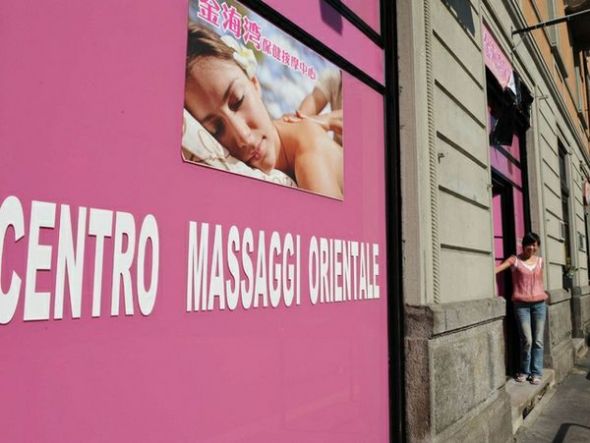
Chinese Corpo-rate Identity in Milan
I have to compliment the Chinese businessmen of Milan for developing one of the most powerful retail identity systems I’ve seen in a long time: instantly recognizable, differentiating, memorable and coherent.
But above all, successful.
I’m talking, of course, about the “Wellness Centres” (massage parlours).
Success? They are popping up like mushrooms. Consider that in 2007 there were 10 in all of Milan. Two years later they over 130. Today, who knows.
And the competition? We’ll honestly I haven’t done much field research into the topic but it seems to me that if you’re trying to open or run a “wellness centre” in Milan and it doesn’t have a bright pink store-front with a certain oriental style, you’re not going to be very successful.
Basically they’ve cornered the market.
And how did they do it? A colour. Pink. It’s that simple.
(Well no, to be fair I guess they must be pretty good at the “Brand Experience” thing as well)
But the real issue for me is that they did it all without the help of a Brand Identity Consultancy.
No research, no strategy, no guidelines. Damn.
Kind of turns things on its head for us experts.


Devi effettuare l'accesso per postare un commento.